


The Challenge
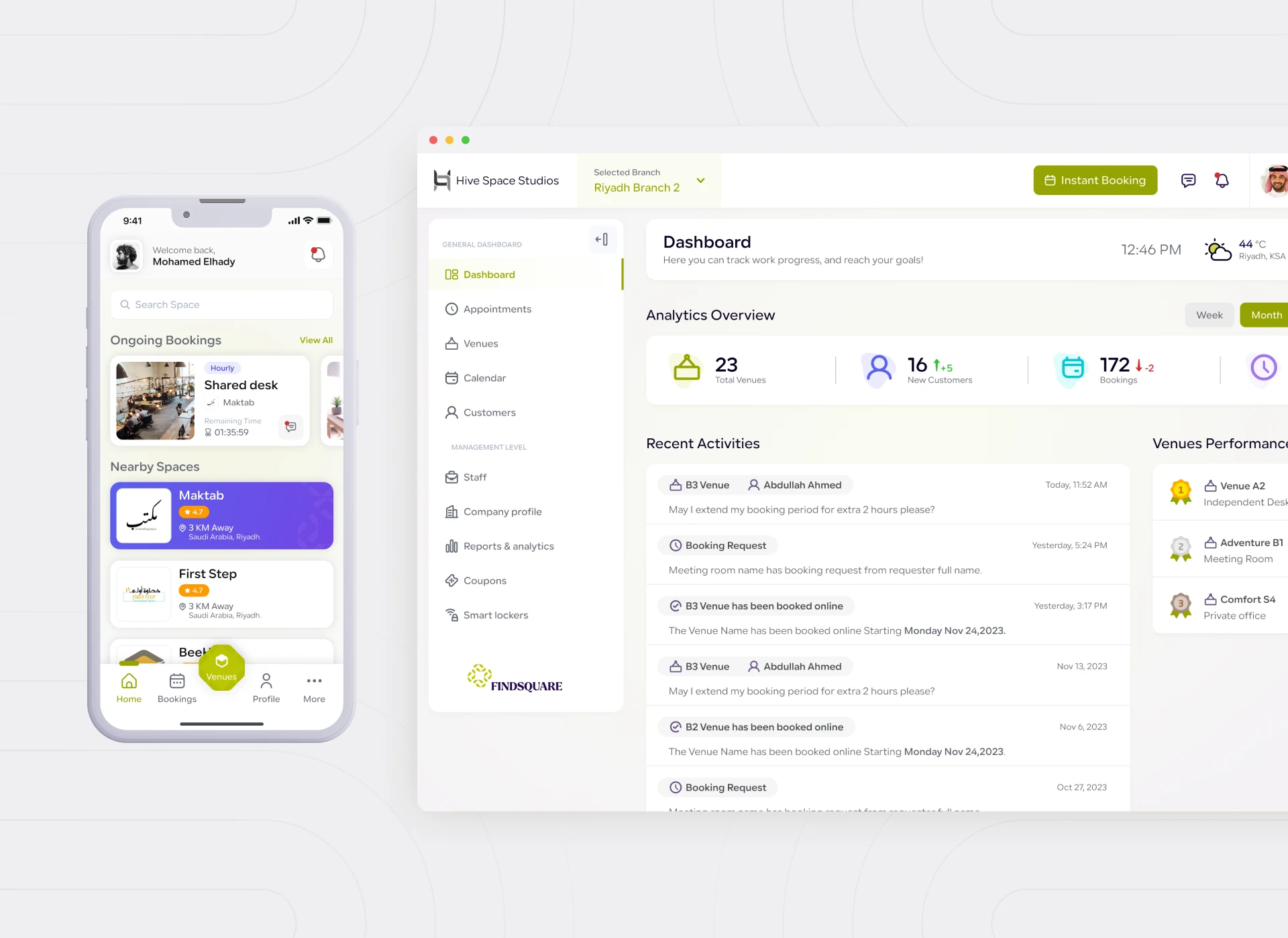
Find Square helps individuals and businesses discover, book, and manage spaces and related services. It spans a web portal, a management dashboard, and mobile apps. The platform already existed — what it needed was a revamp. Specifically, one that removed the friction between a visitor’s intent and a completed booking.
Revamping an existing, multi-platform product comes with a different constraint than building from scratch. There are real users and real workflows already in place. That leaves no room to break what was working while fixing what wasn’t.
The Problem
Three Platforms, Three Different Experiences
Web portal, dashboard, and mobile app had each evolved somewhat independently. That meant a user moving between them hit inconsistent patterns for the same core task: finding and booking a space. And that inconsistency slowed people down exactly at the moment they were ready to commit.
The workflows behind discovery, booking, and management also needed streamlining on their own terms. This wasn’t just a visual refresh layered over the same underlying friction.
Our Design Approach
We treated the booking flow as the product’s single most important journey, and rebuilt it first. Then we extended the same logic and visual language across the web portal, dashboard, and mobile apps. The goal: one product, not three connected ones.
Rather than redesigning every screen at once, we prioritized the workflows with the most friction. Those were discovery filtering and the booking confirmation sequence — the steps most likely to lose an otherwise interested user.
Key Features We Designed Around
- Unified Discovery and Search
- Streamlined Booking Flow
- Consistent Cross-Platform Experience
- A Simplified Management Dashboard
We redesigned the booking confirmation sequence to reduce the number of decisions required at the final step. That’s where usability testing showed hesitation was highest. The management dashboard was simplified too. It’s built around the tasks space owners actually perform most often, not around giving every setting equal weight.
The User Experience
One Product, No Matter Where You Land
We measured the revamp against a simple test. Could a user move from the mobile app to the web portal and immediately recognize the same product? Same logic, same visual language. Consistency became a usability feature in its own right. It reduced the relearning cost every time someone switched platforms.
For a platform serving both individuals and businesses, we also made sure the booking flow scaled gracefully. It had to handle a single quick booking and a more considered, business-scale reservation — without needing two separate experiences.
Lessons Learned
The clearest lesson from Find Square: a revamp isn’t just a visual update. It’s a chance to fix the workflow decisions that were never revisited after launch. Some of the highest-impact changes had nothing to do with visual design at all.
We also learned that cross-platform consistency compounds. Fixing the booking flow once and extending it everywhere delivered more value than optimizing each platform separately would have.
Within one month of launch, the platform saw 250+ additional bookings. Find Square is proof that revamping the right workflow, not just the right screens, is where the real gains are found.
See the full case study: Find Square. Explore more of our work on Smart Bricks, an AI-powered real estate investing platform.
