

The Challenge
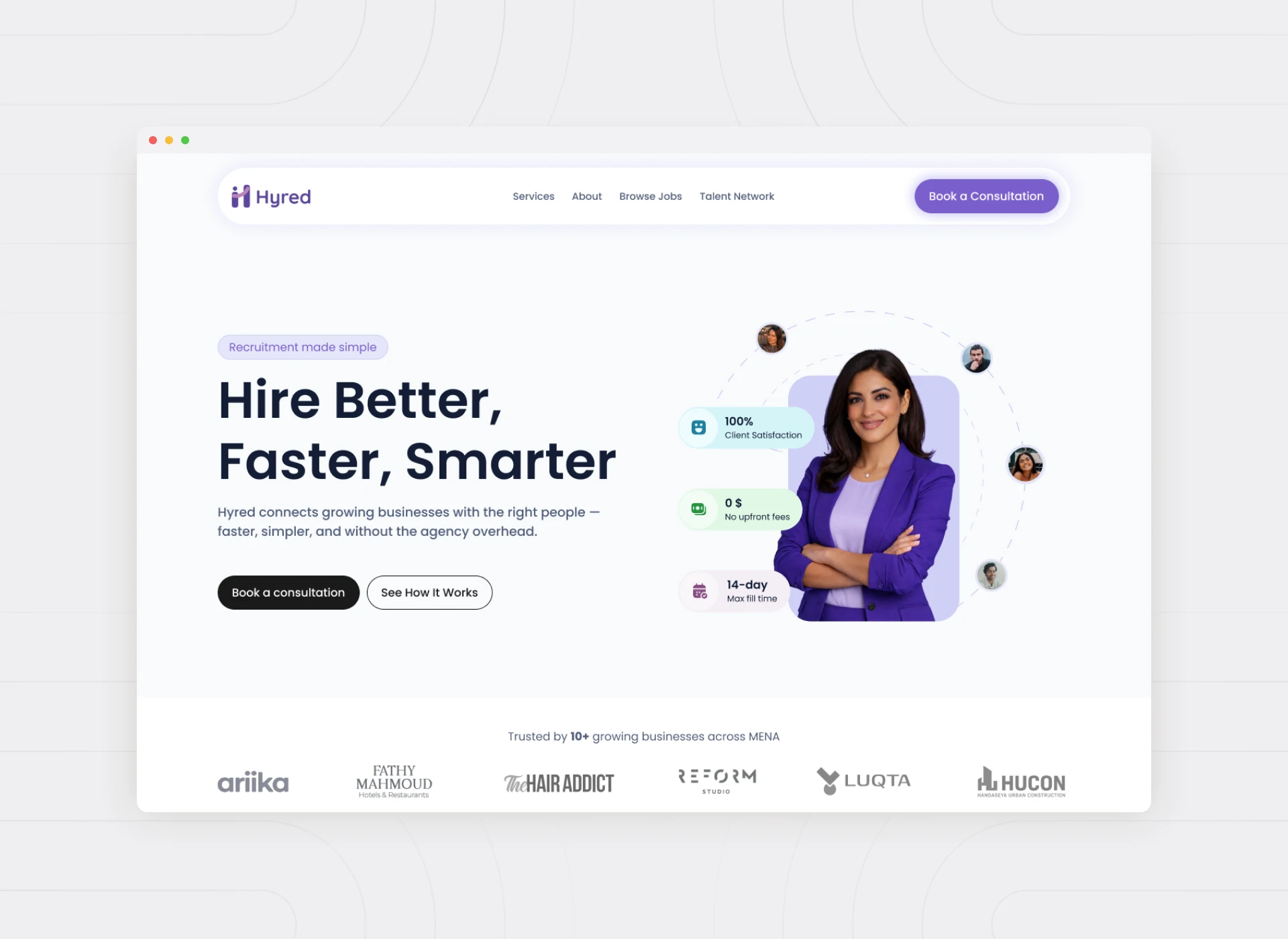
Hyred set out to be more than a recruitment agency. It’s a platform and service brand built to help SMEs and growing businesses hire faster. It combines job posting, applicant tracking, automation, and expert support in one experience. That combination was the entire pitch — and the entire design challenge.
A platform that tries to be software and a service at once can easily end up feeling like neither. Hyred needed an experience confident enough to be trusted with something as important as hiring. And it needed that without the enterprise complexity of the legacy recruitment tools SMEs were trying to escape.
The Problem
Two Audiences, One Fragile Process
Recruitment platforms live or die on two very different experiences happening at once. Employers are trying to hire efficiently. Candidates are deciding whether a company is worth their time. Most existing tools optimized for one side at the expense of the other.
Growing businesses in particular didn’t have the internal HR bandwidth of a large enterprise. But they still needed a process that felt structured and credible — not a spreadsheet with a hiring form attached to it.
Our Design Approach
We designed Hyred around a single principle: make the employer feel like they’ve hired a hiring team, not bought software. That meant surfacing automation and applicant tracking as things working quietly in the background. The visible experience stayed simple, structured, and human.
Rather than a single generic dashboard, we designed the employer and candidate paths as distinct experiences. They meet at the same clear moments: a posted role, a tracked application, a next step. That way, both sides always knew exactly where things stood.
Key Features We Designed Around
- Simplified Job Posting
- Applicant Tracking
- Hiring Automation
- Expert Support, Built Into the Experience
We designed the applicant tracking view to answer an employer’s real question at a glance. Who’s in the pipeline, and what needs a decision? That beat presenting a database view that required interpretation. Expert support was woven into the product itself, not hidden behind a separate contact page. That reinforced that Hyred was a partner, not just a tool.
The User Experience
Structured Enough to Trust, Simple Enough to Use
Every screen was measured against one question: could a busy SME owner, with no dedicated HR function, use it without training? That meant favoring clear defaults and guided steps over configuration options that would only serve larger, more specialized teams.
We positioned Hyred visually and functionally between the extremes of its market. It’s more structured and credible than an informal hiring process, and more approachable and affordable than an enterprise HR suite.
Lessons Learned
The biggest lesson from Hyred: automation should be felt in outcomes, not seen in interface complexity. The moment automation becomes something a user has to configure, it stops feeling like a benefit.
We also learned something else: positioning a brand as more than an agency has to be proven in the product experience itself. Stating it in marketing copy isn’t enough.
Hyred is proof that in HRTech, the winning experience isn’t the one with the most features. It’s the one that makes a growing business feel like hiring finally has a system behind it.
See the full case study: Hyred. Explore more of our work on Masal, a premium storage and interior solutions website.
