

The Challenge
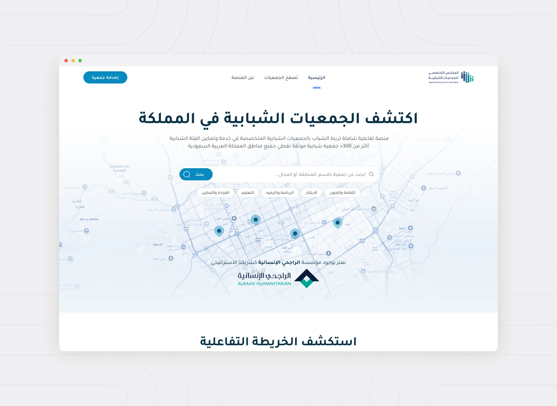
The Specialized Council for Youth NGOs needed one platform for every active youth association across Saudi Arabia. On one side: a directory for the public. On the other: a management dashboard for the associations themselves. Two very different audiences, one shared system.
The team had a two-month timeline and a mandate to serve associations that varied widely in size and digital experience. The platform had to be simple enough for a small local association to manage its own profile without support. At the same time, it had to feel authoritative enough for a national body.
The Problem
Discovery and Management Couldn’t Compete for Space
A public visitor exploring associations and an administrator managing a profile need almost nothing in common from a screen. Yet both had to live within the same platform, without confusing each other’s experience.
We were designing two products under one roof. One: a search and discovery experience built for clarity and trust. The other: an administrative dashboard built for accuracy and ease of self-service.
Our Design Approach
We separated the two experiences early and deliberately, rather than trying to make one interface serve both audiences. The public-facing side was designed around search and filtering, letting anyone find the right association quickly. The dashboard, on the other hand, was built around a single, guided profile-management flow. That way, associations could keep their information current without needing a manual.
Associations ranged from digitally sophisticated teams to volunteers managing things part time. So we treated the dashboard’s simplicity as a form of inclusion, not a limitation.
Key Features We Designed Around
- Public Search and Discovery
- Association Self-Service Dashboard
- Profile Management
- A Unified, Trustworthy Directory Structure
We designed the discovery experience around two fast questions: is this association legitimate and active? Is it the right one for me? Verified, current information became the platform’s core value. On the dashboard side, we prioritized a small number of clear, guided fields over an exhaustive form. That respected the limited time many association administrators had to give it.
The User Experience
Built for the Least Technical User in the Room
With a two-month timeline, we didn’t have room for a learning curve on either side of the platform. Every decision was tested against a single question. Could an association administrator with no technical background manage their profile without asking for help?
For the public side, we treated the directory itself as the credibility statement. A clean, well-organized national directory told visitors this was an official, maintained resource before a single word of copy did.
Lessons Learned
The clearest lesson from this project: when a platform serves two very different audiences, don’t compromise one experience for the other. That’s the fastest path to clarity. Splitting the design early prevented either side from becoming a diluted version of what it needed to be.
We also learned that for public-sector and civic platforms, simplicity is a form of accessibility. Designing for the least technically confident administrator raised the quality of the experience for everyone else too.
Over 1,200 associations are now registered. The platform is proof that a national directory can be authoritative and genuinely easy to use. That’s true both for the public exploring it, and for the associations maintaining it.
See the full case study: Specialized Council for Youth NGOs. Explore more of our work on Hyred, a recruitment platform for growing businesses.
